
TheMassageCo.net
A salon for proffesional massage
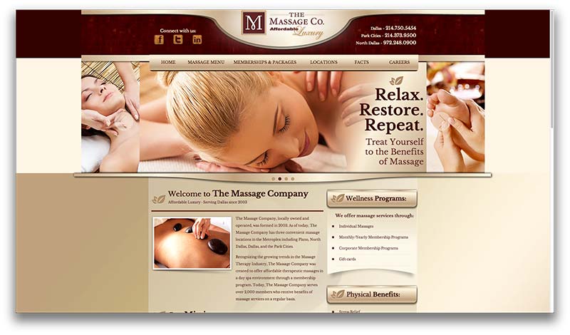
The first thing that caught my attention was the esthetic appeal of this site. I have to admit, they used my favorite color scheme. I love the richness of the dark reds and tans with darker borders and fills. Each page has a lot of imformatin but, because of the design and layout it's very easy to read and pleasing to the eye. They used reponsive design and, in their line of work it would kill thier business without it.
This is a basic website without a lot of bells and whistles but it's great for this type of business for the cliental they are trying to reach. Kind of a modern day yellow page ad. The only thing I would have liked to have seen, are some images of the inside of the business. As a new client I like to know where I'm going. Other than that minor detail, this one seems to have what it needs to draw clients... fast!