
Nike
"Just do it"
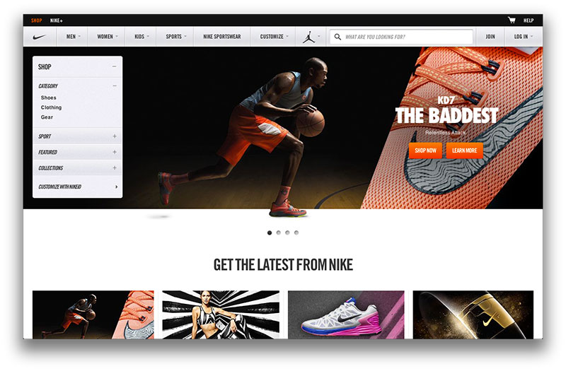
When thinking about a brand or product that really cares about design, there is no way I would have missed Nike.
This site is not like its products in my opinion. I personally like the Adidas site more, this site feels even more congested than Adidas. I believe the images and color scheme fit the site perfectly, but the layout needs change. This may just be a matter of taste, but I do not like the navigation bar that opens up with so many options. After further analyzing the site structure, it seems this site is the home to many other Nike sites. The other sites that are more specific to a product are much more minimalistic and responsive to user needs.