
Adidas
"All in or nothing"
World Cup sponsors are up next!
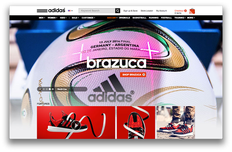
I noticed right away this site follows the colors of the brand, simple black and white. However, the site feels a little congested for me. The navigation bar does not scroll with me, but at the same time the site is short. The top of the site has pictures that change overtime, the timer on the switch might be a little too fast. The pictures are of great quality though (featuring Messi at the front of course). Going down the site I feel a little lost, it seems I have entered a clothing website. Although the site does sell clothes, I think the style of the website could have stayed more simplistic showing off pictures of products and allowing the viewer to select what he or she wants to know more about.