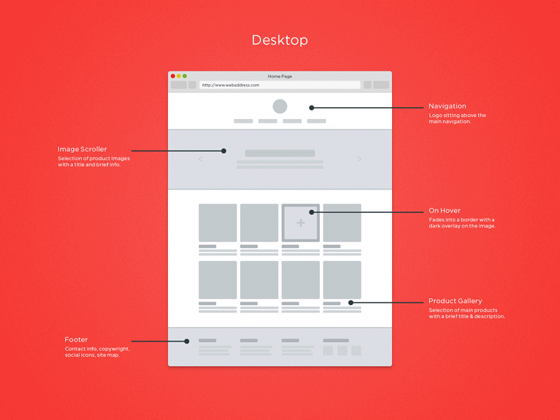
Responsive Web Design
What is it?
For the last few years in the web community, there's been a crazy hype about the concept and implementation
of responsive design. And rightfully so! It's completely changed the way we designers and developers approach
a project, and help clients reach specific business needs.
Responsive Design, a term first coined by established designer/developer Ethan Marcotte, is this concept
of enabling a website or web application to "respond" to the size of a users device display size, and
present content accordingly. I'll try to explain. On the web, Content is King. The content displayed on your
webpage is really the basis for achieving excellent search ratings with google, bing, or any other sophisticated
search engine.
As designers, our goal is to display this content in the most effective way according to the role a website has
with the a company (ie: drive sales, get leads, signups, inform, etc.). This is the what's challenging with
designing responsively. When designing responsively from a mobile first approach, the designer is forced to
make a decision about the absolutely necassary content that needs to be present on a mobile site to attain
maximum effectiveness. This is often difficult because we fall that all the information is important. Haha.
Universal Design
How does it compare to responsive design?
So know that you have a bried idea of Responsive design, let's talk about Universal design. Responsive design almost
reminds me of when Flash website really took off 6 or 7 years ago. Everybody who grabbed a computer to build websites
were designing in Flash and literally overusing. Well, we all know what happened to that. Very few site today are built
in Flash.
Like flash, once the sparks hit the fuel, the flames went off and hasn't come down. And it doesn't have to. Let me explain.
With flash, no one came around to sprinkle water on the fire from time to time. There was no standards to the use of it's
wonders. We have the opportunity to do so with responsive design. And that's where Univeral Design comes into play.
As a designer who aim to design responsively, we seek to create a specific user experience for a specific platform. And what
happens is that we create these experiences on everything from mobile to desktop, and piece it together in code. Really,
we should be looking to simplify things more to a standard, consistent user experience, without having to go crazy with specialized
design. The Center for Universal Design has defined Universal Design as: The design of products and environments to be usable
by all people, to the greatest extent possible, without the need for adaptation of specialized design.
As it's core, Universal Design is about design with with a set of guidelines that ensure design is at it's most simplistic,
and minimilistic state. Unlike responsive design, universal design is about developing a set of standards that meets the
needs of multiple mediums and can be applied to any specific medium within that standard.
Think of it like this, the red light was designed to signal automobiles to stop. That was responsive design. The designers thought,
which color for the specific purpose of gettng vehicles to stop would be appropriate. Red. It eventually grew to become the Universal
color to signal "stop" on other mediums such as signs, automobiles, games, etc. Universally, red mean stop. Not just when it's on
traffic lights.