What is Responsive Web Design

What does it mean?

In my own simple terms I would define responsive design as follows: 
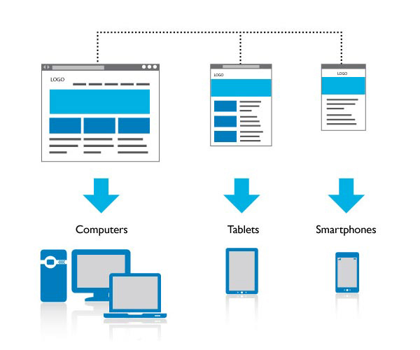
Web design aimed at responding to any device such as tablets, smart-phones, or desktop computer systems. This would not be correct however. It involves web design techniques that are geared towards adapting not only to devices, but to users at all levels of ability and device type.
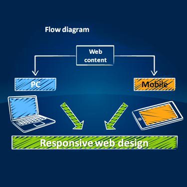
Wikipedia.org defines responsive web design as: An approach aimed at crafting sites to provide an optimal viewing experience. Easy reading and navigation with a minimum of resizing and scrolling across a wide range of devices. Responsive web design methods adapt the layout of the viewing environment using fluid proportion based grids, flexible images, to include CSS media queries.


Who Coined the term?

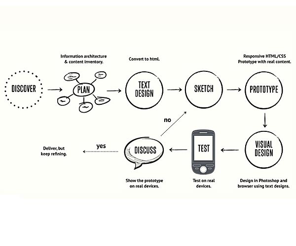
Ethan Marcotte a well known web developer, author and speaker is responsible for coining the term, responsive web design in a May 2010 article titled: "A List Apart". He describes the theory and practice of responsive web design in a book titled: "Responsive Web Design". Subject areas in the book include creating a flexible foundation, and utilizing fluid grid and column layouts.

Why use responsive web design principles and methods in your work?

My thoughts on this are general in terms. With the advent of smartphone, and tablet products evolving on a consistent basis, responsive web design methods are now the required standard. Desktop computer systems are now becoming secondary avenues of gaining information from the internet with the exception of disabled persons needs. Combining both adaptive and responsive techniques for "all users" is the best solution possible.

What are some techniques and practices used in creating responsive web layouts?

    Techniques:

  • Using percentages as units of width.
  • Using "em" space units for font sizes.
  • Utilizing a grid system method of layout to organize page elements.
  • Using media queries to define responsive break points in layout.
  • Creation of fluid images to adapt to screen size on multiple devices.

    Practices:

  • Creation of responsive menus to adapt from desktop to small screen devices.
  • Identifiable page categories such as a site "ID" or title for each page displayed.
  • Make the viewing environment as pleasent as possible through the use of easily identifiable menu names, icons, and image descriptions for all users.

How does responsive design relate to universal design?

My view is that all users novice, expert andpersons with disabilities, must have the capability to access information when theyneed it, and as web designers we must create websites that are adaptive to the user environment and device type.


According to softwarehumanfactors.com they state the following:

Responsive web design and universal web design relate to each other so that all users have to have equal access to information and applications that the internet has to offer.

    In addition, they list seven principles as a guideline:


  • Equitable use
  • Flexibility in use
  • Simple and intuitive use
  • Perceptable information
  • Tolerance and Error
  • Low physical effort
  • Size and space for approach and use

Responsive Gallery

To the left are a selection of images related to responsive web design and a few example charts. Simply click on an image to see the entire gallery of images.